Part of a piece of freelance work was creating a logo and brand identity for Photographer Holly. She wanted to use her name, the colour yellow and have a logo which would work not only as her watermark on photographs but also on social media and any promotional items.
Starting off with having a brain storm is the easiest way for me to collate my thoughts and ideas before going into Illustrator to digitally create some of the ideas.
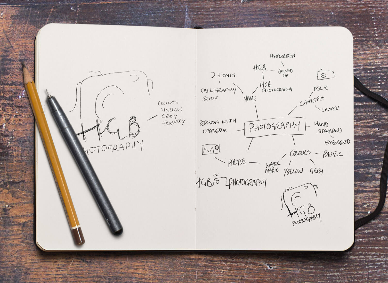
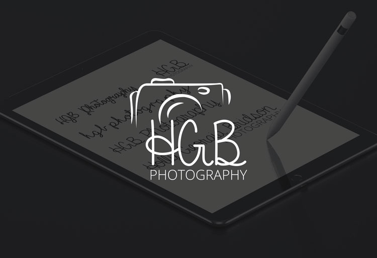
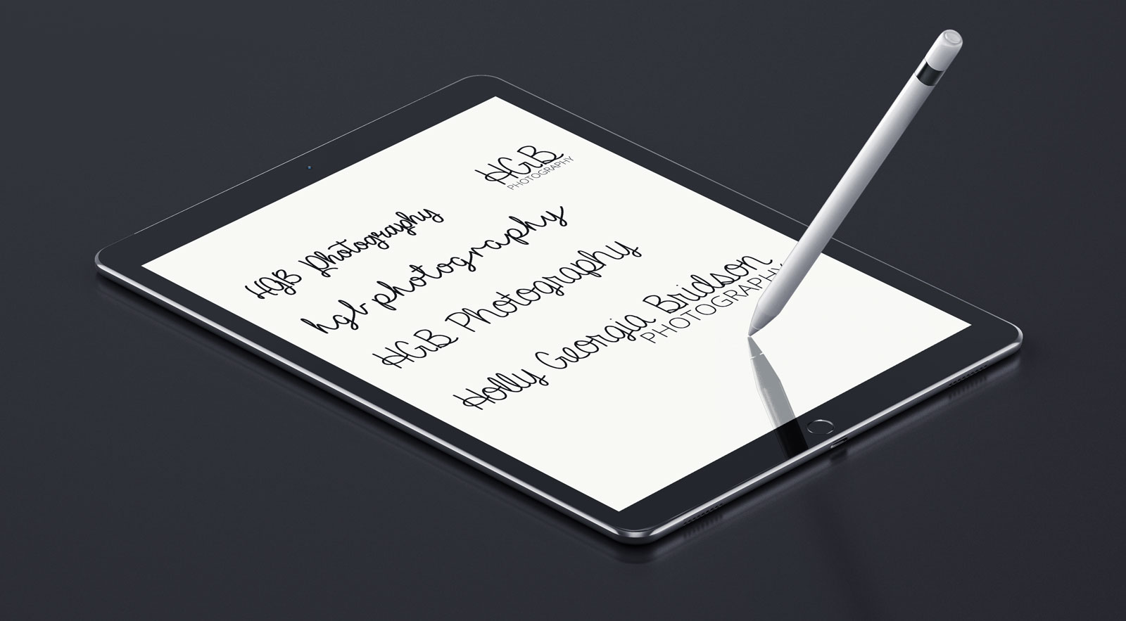
Usually the first thing I do is have a play around with lots of different fonts, due to Holly wanting to have a hand written style this meant that ti needed to be legible at quite a small size. At the time she was undecided if she wanted her fully name or her initials in capitals, from these early ideas she decided to go with her initials. Having them in capitals meant quite a few fonts were eliminated because of one of the letters being hard to read.
From these I came up with quite a few different concepts and how I wanted to include a camera without the logo as per the clients request however these were the final 3 that were put forward to the client. I always find it best to give 2 or 3 options to
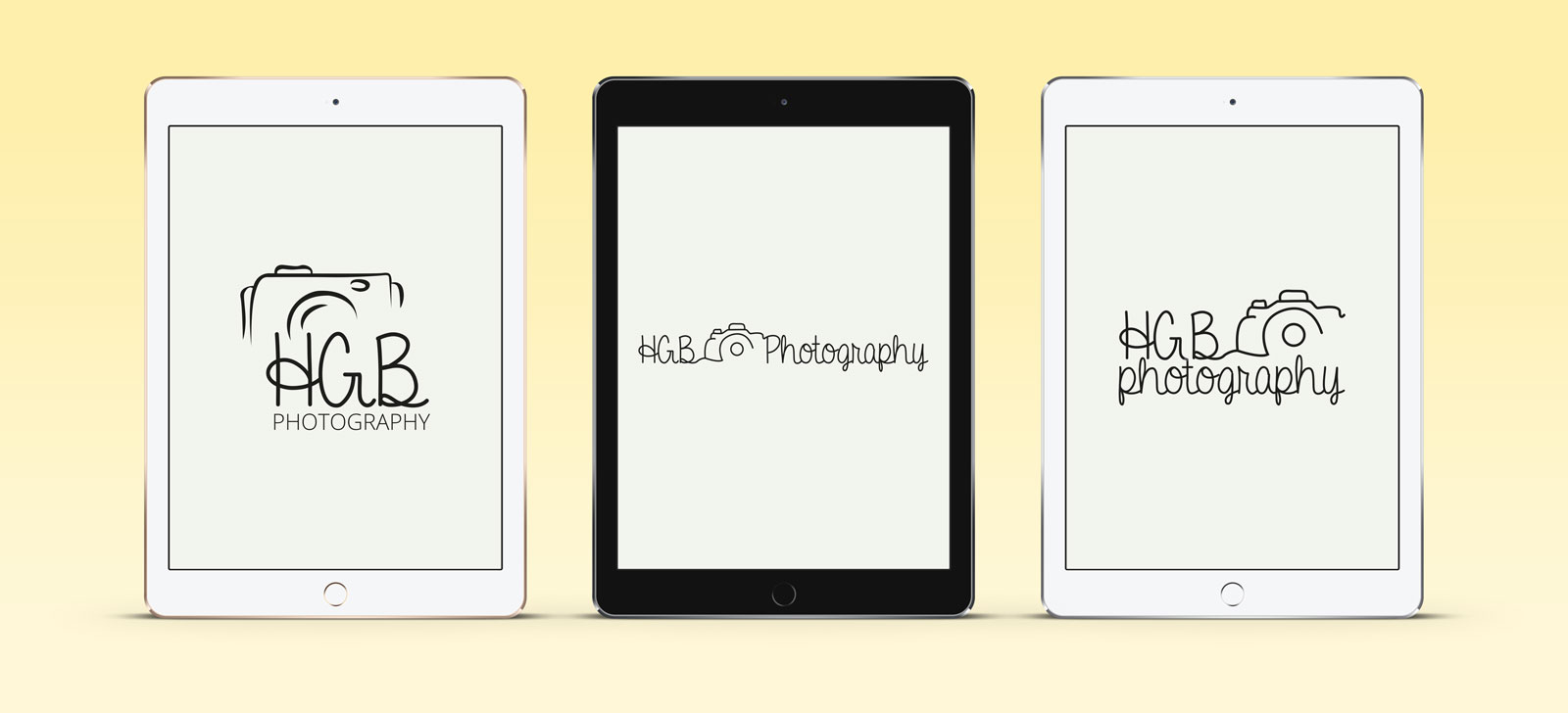
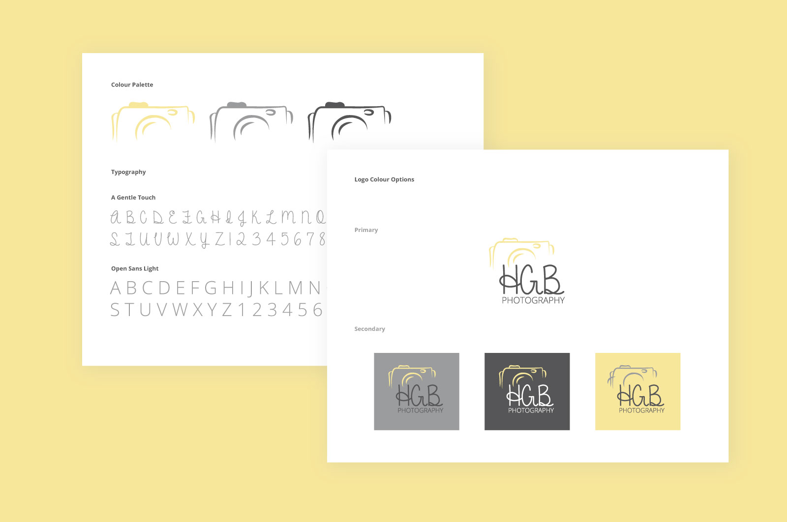
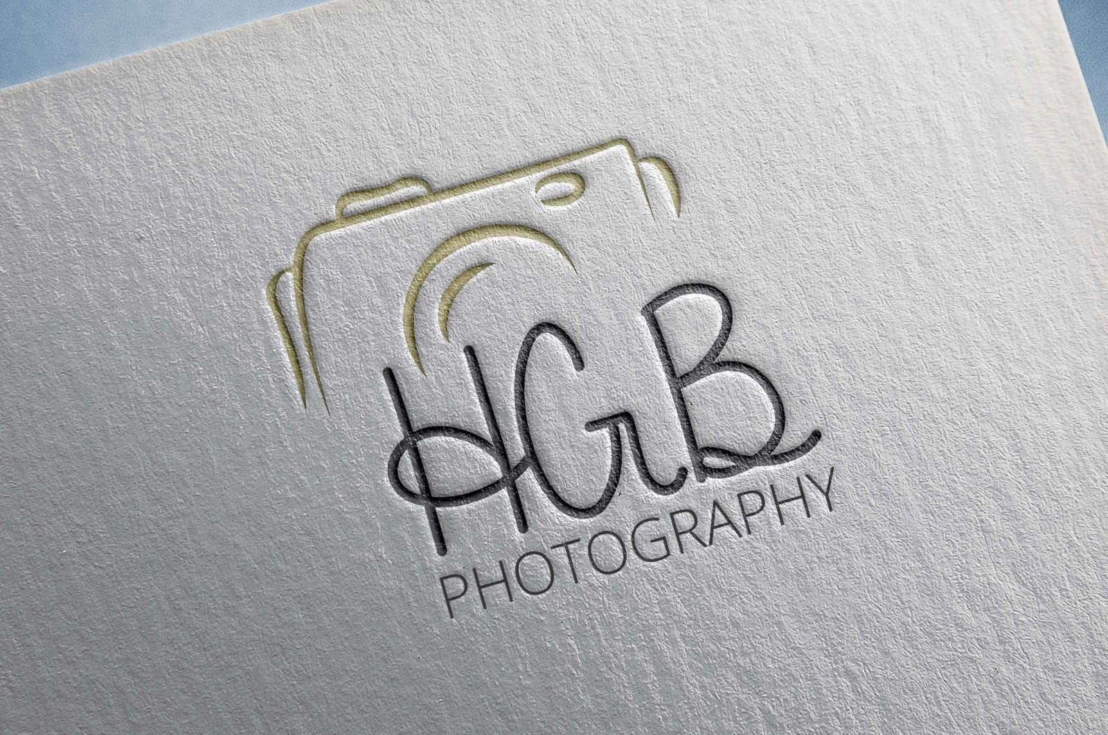
The following logo was chosen. The client wanted to have a pastel yellow as the primary colour so to complement this I used 2 shades of grey.
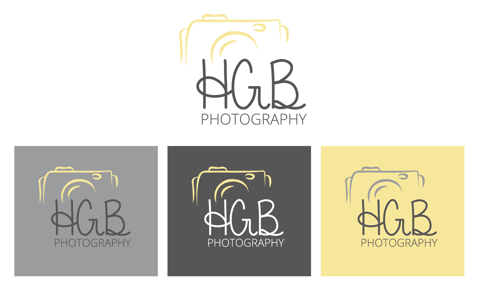
I created a set of brand guidelines to ensure brand consistency.